One of the often overlooked features of Google Keyword Planner is the graph functionality. It’s simple, easy to navigate and perfect when you need a quick graph showing information on keyword trends. Data can be broken down into many different ways with these graphs. Once you learn how to navigate them they’re also pretty handy in an impromptu meeting or for clients and coworkers who prefer visuals.
AdWords offers four different graph options:
- Search volume trends
- Mobile trends
- Breakdown by device
- Breakdown by location
Search Volume Trends
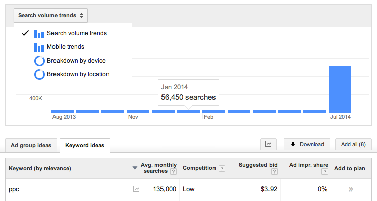
The default setting shows search volume trends over a given time period. For this example I’m using some ppc related keywords. Sometimes you get wacky-looking data (like above). July 2014 is an outlier. Let’s remove that month to get a better visual on the fluctuations from month to month. This can easily be done by adjusting the Date Range widget in the left column in the Keyword Planner interface.
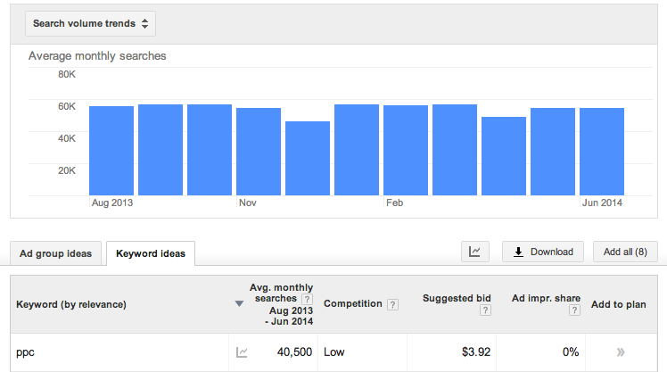
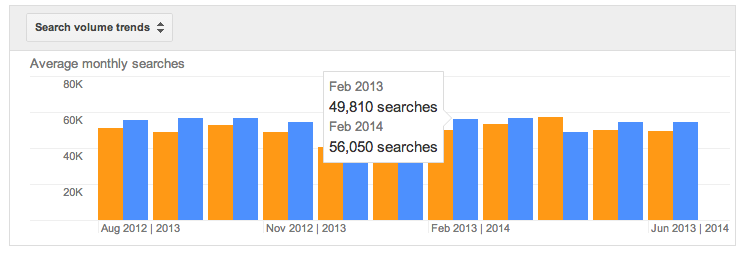
Now we have a better looking graph. We can see that the search volume for ppc related keywords isn’t seasonal and hasn’t really increased over the past year. Let’s say we wanted to compare period to period. Below I’ve compared to the same period last year and we can see that there has been growth although it is pretty steady.
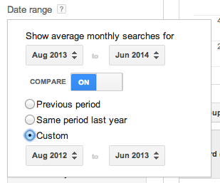
The Date Range widget (below) can be used to compare any date range. This is quite useful if you want to check the expected impact due to seasonality or see if a keyword has become more or less popular over time.
Mobile Trends
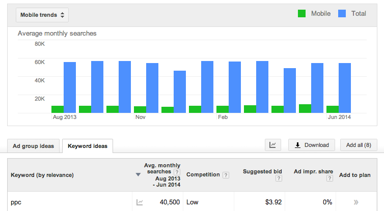
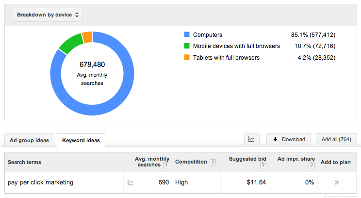
Next up is mobile trends. Here we can see that there are not nearly as many searches on mobile for the ppc keywords I entered. I guess this isn’t too surprising as these are likely taking place on desktops during the work day. Do you know what is surprising? This next graph.
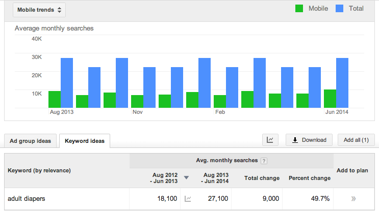
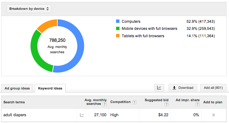
Look at that data! Roughly 1/4 of adult diapers keywords were searched on a mobile device. Check out how much larger the mobile use percentage is for “adult diapers” related keywords compared to the “ppc” keywords. You didn’t know granny was so tech-savvy did you?
Breakdown by Device
This one is pretty straight forward. The graph shows you the percentage of searches done on a desktop, mobile devices, and tablets. Again we can see the proof that grandmas and grandpas looking for adult diapers (below) are more tech-savvy than ppc marketers (or so one might argue).
Breakdown by Location
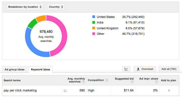
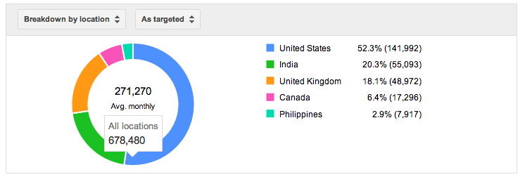
If you’re doing international marketing data like this can help you determine your portion of spend targeting each country. However, if we look at this graph we notice a huge percent is in the Other category. That isn’t going to help us much. We need better info.
I know I’m going to be running ppc campaigns in the United States, India, United Kingdom, Canada and the Philippines. So in the left hand column, under Targeting, I change my targeted locations to those countries. This can also be done on a state-by-state level allowing you to optimize your spend in areas of the country which have a higher percentage of your demographic.
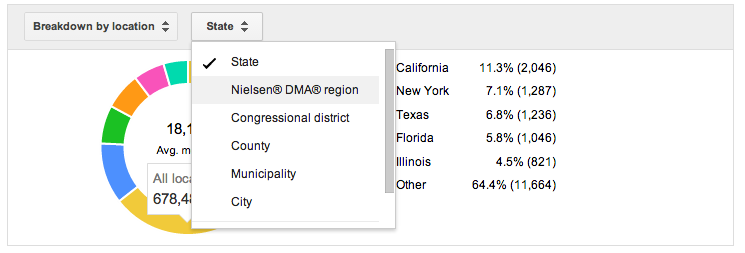 Play around with the interface. As you can see above their are many more options to look into. Google is always adding new features and sometimes removing features so always keep your eyes on the lookout for changes and more useful additions to Keyword Planner’s interactive graphs.
