After working with a number of retail sites and blogging on men’s style I’ve come up with this list of some of the most common marketing mistakes made on retail websites.
1. Not Telling Your Company Story
Sure you may have an about us page (surprisingly many do not), but do you tell us about the interesting side of your company? Many PR efforts focus around having a compelling brand story. If you don’t, you’re missing out on many opportunities to get the media to introduce your brand to a larger audience.
Japanese shoe brand, Onitsuka Tiger, has a unique story to tell behind its classic Corsair model featuring Nike co-founder, Bill Bowerman. However, this story is difficult to discover on their website. By showcasing this story they may be able to turn more visitors into customers.
Another and even worse example of this is another shoe brand, Converse. There are so many cool stories surrounding Converse sneakers that Complex published an article titled 50 Things You Didn’t Know About Converse Chuck Taylor All Stars. Why isn’t this posted on the Converse site? If a potential customer can learn more about your company’s past from Wikipedia than from your own site, you can do much better.
2. Using Images That Need to Be Cropped
This is one of the marketing mistakes I see most often on retail websites. Just like making your content easily sharable, you also need to make your content easily usable by those who link to you and promote your products on their blogs.
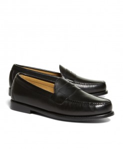
This image taken from www.brooksbrothers.com would clearly need to be cropped on both the top and bottom in order to look good in a blog post. Bloggers are busy people and time is money. By placing images on your site that are easy to use, there is a higher chance they will use photos from your site, mention your products, and link to your site more frequently.
You want to make using and sharing your content as easy as possible. Another killer are those zoom-on-hover flash images. They make using an image from a site horribly painful.
3. Naming Images Improperly
No matter what anyone tells you for whatever reason, img466u26osd.png is a horrible name for an image. Image names should be descriptive. Ask yourself one question, “What anchor text would I want people to link to this image with?” If the answer isn’t the current name of the image file, change it.
4. Not Showing Your Print Ads
This especially holds true for classic brands. People are interested in seeing your brand history through your advertisements. Bloggers love to find good pictures of old ads. Classic companies should have these ads on file somewhere. Make digital copies and put them up on your website. Create a timeline of ads.

You don’t have to be a classic brand to do this. Suit Supply gets a lot of interest from its controversial ad campaigns. Hosting images of the campaigns on their site attracts a lot of links from top sites like GQ. When they release an ad campaign, two things are certain, you will see some scantily clad women (or nude women of you live in Europe) and they will get a lot of links and press.
If your company creates a video ad that goes viral, don’t let YouTube get all of the links. Host the video on your own site as well with extra content not available on YouTube. Add this information with a link from your video description on YouTube, driving people to your site. They will also link to you instead of YouTube because you have better content.
5. Not Showcasing Your History and Heritage
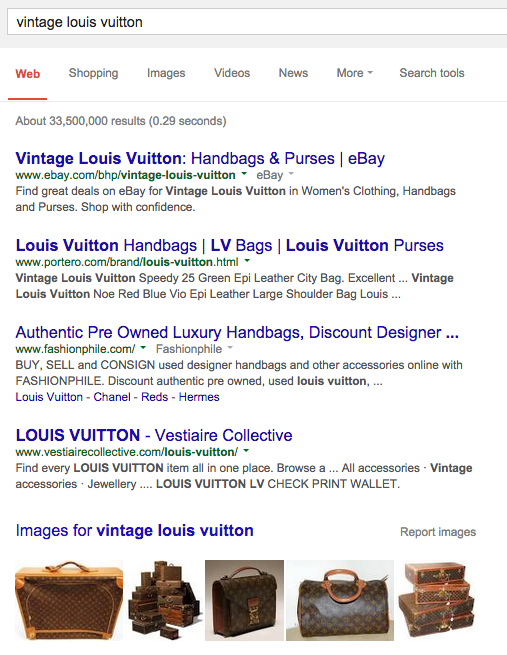
Louis Vuitton is the perfect example of a company with a fabled line of products. Antique LV luggage is highly collectible and draws a lot of interest. There is a slideshow here yet it doesn’t cover the range of images and styles they must have catalogued.


6. Not Optimizing for Everything Brand Related
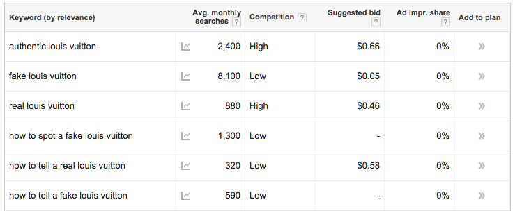
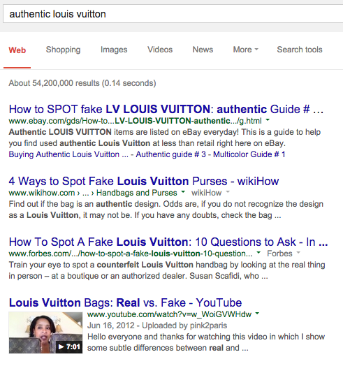
Louis Vuitton does not even rank for the term “authentic louis vuitton” despite being opposed to counterfeiters. You would think they would want to be informing consumers how to tell a real Louis Vuitton from a fake. After all, they have a section of their site on brand protection and keeping people from purchasing fake items is in their best interest.

These are searchers looking for an authentic item. They are likely halfway towards making a purchase. The best way to ensure you’re purchasing an authentic Louis Vuitton is to purchase from Louis Vuitton.

7. Using Search Engine Unfriendly URLs
This one is a killer. People often link to your site using the URL. Using a search engine friendly URL will help get your keywords in anchor text pointing to your web page. Optimized URLs still rank better than unoptimized URLs and are more searcher friendly. Take a look at this URL from Jos. A. Banks – http://www.josbank.com/menswear/shop/SubCategory_11001_10050_1002500. What, you can’t tell what it’s about? It’s a page for tailored fit dress shirts, although you’d never know that from looking at the URL.
8. Having Duplicate Pages for the Same Item
The main issue I have with this is that having multiple pages with the same content just takes a lot more time to manage, time that could be spent doing more productive tasks. Duplicate pages are not necessarily bad for SEO as Google does pass value with rel=”canonical” like a 301 redirect. If you can’t avoid this, make sure you are using rel=”canonical” tag.
9. Not Redirecting Discontinued Items
I see this happen a lot. Site managers get busy and forget to redirect old URLs. This can be especially problematic in the fashion industry where items turn over very quickly. Add redirecting old URLs into your processes. One month ago I wrote a post on classic sneakers for my style blog. One month later and one of the links I was going to use, brand.puma.com/clyde, already returns a 404 error. I’m glad I linked to a different page instead.
10. Renaming Classics
If you change the name of a classic item (or the item has a nickname), make sure you are still optimizing for the former variant or you will be losing a lot of purchase oriented traffic and money. A search for “site:puma.com clyde” reveals many places the brand uses the term Clyde. Despite this, the product pages do not mention the word Clyde at all.
11. Not Offering All of Your Products Online
Case in point, the Nike Cortez; Foot Locker has them yet Nike has nothing on the classic shoes, only updated versions. Don’t they make them? Sometimes manufacturers and retailers have strict contractual arrangements. If you can’t sell some of your items for contractual reasons, at least inform visitors where they can be purchased. Everybody wins.
Mezco Toyz’ Breaking Bad action figures should all be sold from their company site. However there are variants that are easily found on Amazon, but not on the company site. Make it easy for collectors to find and purchase all of your products. Doing so will keep them collecting for a longer period of time and purchasing all of the collectibles. Once a collector starts missing out on a few items that can’t be found they will likely stop collecting your pieces. After all, who wants to continue collecting to have an incomplete set? Nobody, that’s who.
Conclusion
Retail sites are constantly being updated, which means that simple fixes that can give your marketing a boost are often forgotten in a rush to get new products published. Retail brands also create a lot of content or have access to old content that can be repurposed (old advertisements for example). There’s always room for improvement and I hope this post has given you a few good places to start improving your retail website.

